
Renovation
How to Work Flowers into Different Color Schemes
Interior design is more than the arrangement of furniture and fittings. For example, it usually starts with choosing the interior colours, which become the foundation for what happens next.
Many designers look to flowers to create the right ambience in a room, e.g., for a special occasion or to match the season. Additionally, you may wish to start the process by creating an unforgettable curb appeal with flowers and lights.
You won’t need a florist to do this for you; in this post, we dive into colour theory and how to match flowers with your colour schemes.
Colour Theory
As with any artistic practice, the usefulness of colour theory in floral design remains incredibly important to the industry. Why? Well, it carries the first impression of the piece, or in this case, arrangement.
To express cheerfulness or sadness or give any room a modern twist, the starting point to getting the right ambience is understanding how to mix and match different colour schemes with floral hues.
What is the Color Wheel?
The colour wheel is an abstract illustration organization of different colour hues around a circle that shows the relationship between primary, secondary, and tertiary colours. Red, yellow, and blue are primary colours, as all other colours on the wheel are derived from mixing one or more of these colours. The colour wheel also determines what hues will look better beside each other.
There are a few colour rules you can use to seek inspiration from. You can use the flower’s colours and the colour schemes in your home to find the perfect bouquet.
Complementary Colors
On the colour wheel, a complementary colour consists of two opposite colours. An example of commonly seen complementary colours is red and green because of their association with Christmas. If you have a red wall in your home and want to add a more festive look, pick bouquets with abundant green leaves and red flowers that match your wall.
Green is also great to place in any room because the chromophil within those leaves contains a range of health benefits, including removing pollutants from the air. If green and red aren’t your style, you can choose teal and orange for a bold look or gold and purple to give the impression of luxury and high class.
Monochromatic Colors
In a monochromatic bouquet, choose one colour and place one or two darker or lighter-colored flowers of the same shade in the vase. Various shades of red and pink are popular on Valentine’s Day, but they’ll look great in your home against a white wall. Yellow tulips and carnations will also stand out in an orange or grey.
Split-Complementary Colors
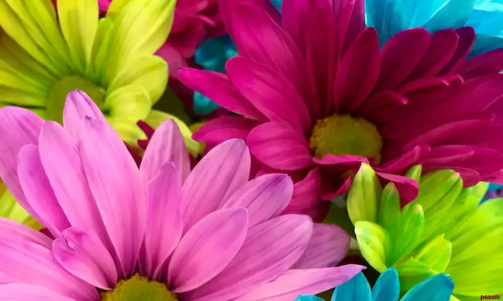
Split-complementary colours include a trio of one and two colours beside the opposite. Examples include Fuschia, orange, green, red, teal, and chartreuse. You can use bold flowers for a striking combination or choose softer hues to overwhelm the rest of your home. You may have too many colours in one room if you aren’t careful.
If you want this scheme, use fuschia and orange flowers against a green wall or other colours.
Don’t forget that you’ll need to include the flower branches and leaves in this colour scheme, which could complicate the arrangement.
Analogous Colors
Analogous colour schemes are simple to pull off in a home because they’re colours beside each other on the wheel. You can use two, three, or four colours, but typically, using two colours works best. For example, if you have a yellow wall, adding chartreuse or gold flowers to a bouquet will blend well with the rest of your home.
Triadic Colors
In a triadic colour scheme, choose any three equally distant colours on the colour wheel: purple, orange, green or blue, red, and yellow.
To use this colour scheme properly, pick between primary, secondary, or tertiary colours to make a fantastic and breathtaking bouquet. Triadic will work wonders if you love bright colours that stand out against a muted wall.
If you want to tone down this combo, add muted flower groups rather than sticking to a bold template. For example, use a soft purple and green and add a deeper orange as an accident for a jewel-toned arrangement.
Mix and Match
There’s much more to matching colour with floral design; now you know how to approach it. Your next goal is to choose the right interior design software – see our Top 5.


